
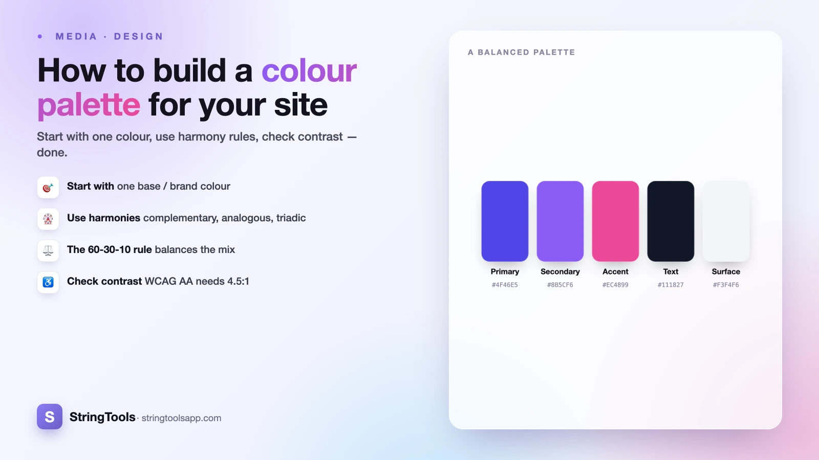
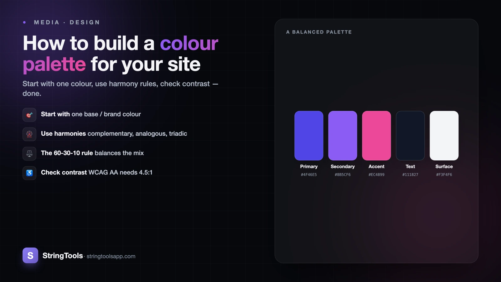
Why most homemade palettes look wrong
You pick a color you love, add another that catches your eye, then a third for the button. A week later the site feels noisy and amateur, and you can't say why. The problem is almost never the individual colors. It's the lack of a system.
Professional palettes look calm and intentional because they follow rules: they start from one anchor color, expand using predictable relationships on the color wheel, ration how much of each color appears, and get checked for readability before anyone ships them. None of this requires talent or a design degree. It requires a process and a way to capture exact color values.
This guide walks through that process end to end. By the finish you'll have built a real, working palette, and you'll understand every decision behind it. Grab exact HEX, RGB, and HSL values as you go with the free color picker.
Start with one base color
Every good palette grows from a single seed: your base or brand color. If you already have a logo, a product, or a favorite shade, that's your starting point. If you're starting from scratch, pick one color that matches the mood you want. Blues read as trustworthy and calm, greens as fresh or financial, warm oranges and reds as energetic, purples as premium or creative.
Resist the urge to choose three or four colors right away. One anchor is enough, because the rest of the palette will be derived from it mathematically. That's how you get harmony for free instead of guessing.
Capture your base color as a precise value, not a vague idea of "blue." Say your brand blue is #2563EB. In HSL that's roughly hue 221, saturation 83%, lightness 53%. HSL is the format worth learning here because hue, saturation, and lightness map directly to the moves you'll make next. If those three formats feel unfamiliar, the companion guide on HEX vs RGB vs HSL explains exactly what each number controls.
Expand with color harmonies on the wheel
Color harmonies are proven relationships between positions on the color wheel. Pick one harmony and it tells you which colors to add. There are four you'll use most.
Complementary means the color directly opposite yours on the wheel, 180 degrees away. Our blue at hue 221 has a complement near hue 41, a warm amber. Complements create the strongest contrast and are excellent for a single accent, though using them in equal amounts can feel jarring.
Analogous means the two or three neighbors beside your base, roughly 30 degrees to each side, so around hue 191 and 251 here. Neighbors share undertones, so analogous schemes feel serene and cohesive, ideal for backgrounds and gentle gradients.
Triadic means three hues spaced evenly, 120 degrees apart: hue 221, 341, and 101. Triadic palettes are vibrant and balanced but need discipline, so let one hue dominate and treat the others as supporting.
Monochromatic means a single hue where you vary only saturation and lightness. It's the safest, most elegant choice for beginners and the foundation of the next step.
Generate tints and shades from one hue
Whichever harmony you choose, you need more than one version of each color. Buttons need a hover state, cards need subtle backgrounds, text needs a darker variant. You create these by holding hue and saturation steady and changing only lightness in HSL. Raising lightness toward 100% gives you tints (lighter). Lowering it toward 0% gives you shades (darker).
Starting from our base at hue 221, saturation 83%, lightness 53%, a practical scale looks like this. Very light tint near lightness 96% for page backgrounds. Light tint near 90% for hover states on light surfaces. The base at 53% for primary buttons and links. A shade near 42% for button hover. A deep shade near 30% for pressed states or headings on light backgrounds.
That single hue now does five jobs while staying unmistakably one color. Repeat the process for any secondary color in your harmony. Build the scale by nudging the lightness slider and reading off the exact HEX at each stop with the color picker, so you can paste real values straight into your CSS.
Apply the 60-30-10 rule
Having colors is not the same as knowing how much of each to use. The 60-30-10 rule, borrowed from interior design, gives you the proportions that make a layout feel balanced.
Roughly 60% of the visible area is your dominant color, which for most websites is a neutral: white, off-white, or a light grey background. This is the room the rest of the palette breathes in. About 30% is your secondary color, used for surfaces, cards, sidebars, footers, and section bands that structure the page. The final 10% is your accent, the loud color reserved for the things you want clicked: primary buttons, active links, key highlights.
The ratios matter more than exact math. The lesson is that your brightest, most saturated color should be the rarest. When an accent covers 40% of the screen it stops being an accent and starts being noise. Keep the loud color scarce and every call to action gets more powerful, not less.
Check contrast for accessibility
A palette that looks great but can't be read is a failed palette. The Web Content Accessibility Guidelines set measurable minimums, and they are non-negotiable if you care about all your visitors and about legal exposure in many regions.
WCAG level AA requires a contrast ratio of at least 4.5:1 between normal text and its background. Large text, meaning roughly 18.4px bold or 24px regular and up, needs at least 3:1. That same 3:1 minimum applies to meaningful graphics and UI components like input borders. Contrast is a ratio calculated from the relative luminance of two colors, ranging from 1:1 (identical) to 21:1 (pure black on pure white).
The practical trap is light text on a mid-tone brand color. Our #2563EB blue carries white text at about 5.1:1, which passes for normal text. Push the blue lighter to something like #60A5FA and white text can fall below 4.5:1 and fail. Test every text-on-color pairing, and when one fails, adjust lightness until it passes rather than abandoning the color. Sample the exact values with the color picker before you check them.
Add neutrals and semantic colors
Your harmony handles brand personality, but a real interface needs two more small families. First, neutrals: a short ramp of greys for text, borders, dividers, and backgrounds. Build them the way you built tints and shades, but keep saturation very low. A subtle trick is to give greys a tiny amount of your brand hue, say saturation 6% at hue 221, so they feel warm or cool in step with the palette instead of dead grey.
Second, semantic colors, which communicate state rather than brand. The web has strong conventions here: green for success and confirmation, amber or yellow for warning, red for errors and destructive actions, and often a blue for informational messages. Use these consistently and users understand your interface without reading a word. Each still needs to pass the same contrast checks as everything else.
These families are functional, not decorative, so keep them muted enough that they never compete with your 10% accent for attention.
Build one palette start to finish
Let's assemble everything into a working set. Base brand color: #2563EB, a confident blue. Harmony: monochromatic for the core, plus the complementary amber near #F59E0B as the accent, giving warmth against all that cool blue.
Neutrals: near-white #F9FAFB for the 60% dominant background, a soft #E5E7EB for borders, mid-grey #6B7280 for secondary text, and near-black #111827 for body copy, which clears 4.5:1 comfortably. Secondary surface, the 30%: the light blue tint #EFF6FF for cards and section bands. Accent, the 10%: the amber #F59E0B for a promo badge, with the primary blue #2563EB reserved for buttons and links.
Semantic set: success #16A34A, warning #D97706, error #DC2626. That's about a dozen deliberate values total, each with a clear job, each contrast-checked. Small, disciplined palettes always beat sprawling ones, because constraint is what makes a design feel coherent.
Ready to build yours? Open the free color picker to grab exact HEX, RGB, and HSL values, dial in your tints and shades, and start assembling a palette you can paste straight into your stylesheet.
Frequently Asked Questions
How many colors should a website palette have?
Aim for a small, disciplined set of about 8 to 12 defined values. That typically means one or two brand colors expanded into tints and shades, a short neutral grey ramp, and three or four semantic state colors. Fewer well-chosen colors look more professional than a large, scattered collection, because constraint creates the visual coherence users read as polish.
What is the 60-30-10 rule in web design?
It's a proportion guideline for how much of each color appears on screen. Roughly 60% goes to a dominant, usually neutral, background, 30% to a secondary color for surfaces and sections, and 10% to a bright accent reserved for buttons and highlights. The key insight is that your loudest, most saturated color should be the rarest, which keeps calls to action powerful.
How do I make lighter and darker versions of one color?
Work in HSL and change only the lightness value while keeping hue and saturation fixed. Raising lightness toward 100% produces tints (lighter variants for backgrounds and hover states); lowering it toward 0% produces shades (darker variants for pressed states and headings). This keeps every variant unmistakably the same color, giving you a full scale from one hue.
What contrast ratio do I need for accessible text?
WCAG level AA requires at least 4.5:1 between normal text and its background, and at least 3:1 for large text, meaning roughly 18.4px bold or 24px regular and larger. That same 3:1 minimum applies to meaningful graphics and UI components like input borders. Test every text-on-color pairing, and if one fails, adjust the color's lightness until it passes.
What are complementary, analogous, and triadic colors?
They're color harmonies based on position on the color wheel. Complementary colors sit directly opposite each other (180 degrees) for maximum contrast. Analogous colors are neighbors, about 30 degrees apart, for a calm, cohesive feel. Triadic colors are three hues spaced evenly 120 degrees apart for vibrant balance. Monochromatic uses one hue with varied lightness, and is the safest starting point.