
What CPI is, in plain terms
The Consumer Price Index tracks the cost of a basket of goods and services that households typically buy. Statisticians price the same items repeatedly, weight each by how much the average household spends on it, and express the total as an index against a base period. Inflation is the change in that index.
Key Takeaways
- CPI is a weighted average of price changes, not a simple average — a category's weight is its share of household spending.
- The index itself is a level (the base period is usually set to 100); inflation is the percentage change in that level over a period, normally twelve months.
- The basket is refreshed regularly so it still reflects what people buy, which is why very long comparisons rely on chained or spliced series rather than one unbroken basket.
- Headline inflation covers everything; core strips out the most volatile components, usually food and energy, to show the underlying trend.
- Substitution and quality adjustment are genuine methodological debates among statisticians, not evidence of a cover-up.
- Your personal inflation rate will differ from the headline, because your spending pattern differs from the average basket.
The number leading the news stands in for hundreds of thousands of individual prices. Most arguments about whether inflation "feels" right are really arguments about the basket, the weights or the base period — and those you can reason about.
The basket: deciding what to price
A national statistics agency cannot price everything, so it prices a representative sample. The basket is a structured list, usually organised into broad divisions (food, housing, transport, recreation and so on), then into classes, then into specific priced items — a 500g loaf of white sliced bread, a litre of unleaded petrol, a monthly gym membership, a particular category of laptop.
What goes in is decided from household expenditure surveys, retail sales data and national accounts. Items enter the basket when they become a meaningful share of spending and leave when they stop being one. Streaming subscriptions replaced DVD rentals; digital cameras came in and largely went out again as phones absorbed them.
How the prices are collected
- Field collection. Price collectors visit the same shops each month and record the price of the same specified item, so like is compared with like.
- Central and online collection. Prices for nationally uniform items — utility tariffs, rail fares, many online retail prices — are gathered centrally.
- Scanner and administrative data. Supermarket till data and administrative records increasingly supplement or replace manual collection, giving far larger samples.
The governing rule throughout is constant quality: the aim is to price the same thing this month as last month. When the same thing is no longer available, the statistician has a problem to solve, and that problem is where most of the methodological debate lives.
Weights: why not every price counts the same
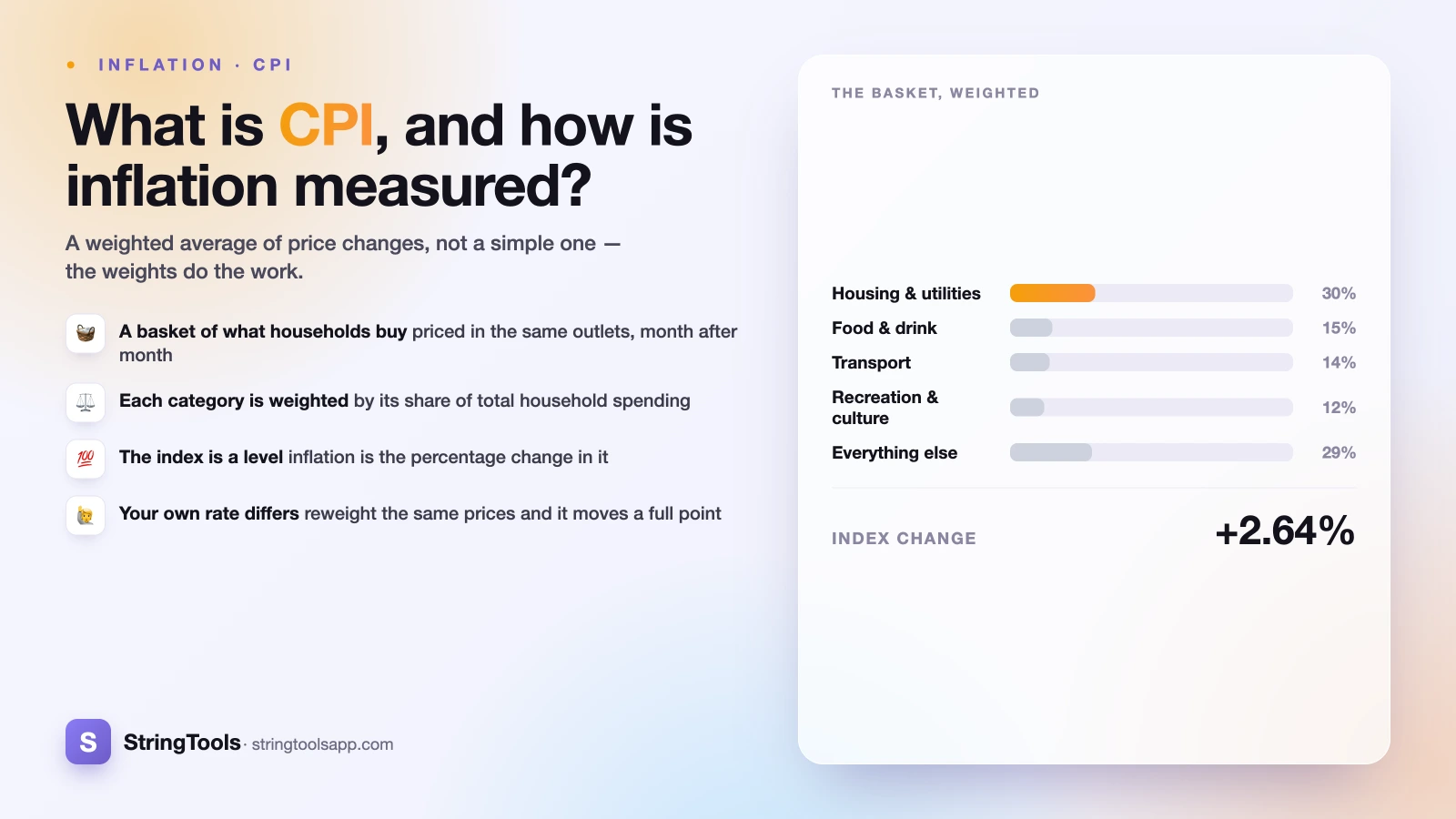
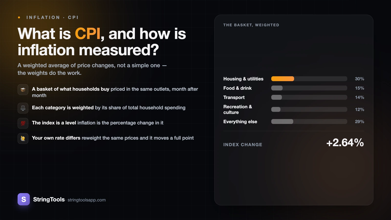
Averaged without weights, a rise in the price of postage stamps would count as much as a rise in rent. So each category is weighted by its share of total household spending.
Weights are usually expressed out of 1,000 or out of 100. If housing accounts for 30 per cent of what households spend, it carries a weight of 30 per 100, and a 4 per cent rise in housing costs contributes 30 x 4 / 100 = 1.20 percentage points to the overall index change.
That single mechanic explains much of the public scepticism about inflation figures. Big-weight categories dominate the headline even when their movements are undramatic, while a grocery item you notice every week may carry a weight small enough that a sharp rise in it barely shifts the total. Nothing is hidden. The index answers "what happened to the average household's total outlay?" rather than "what happened to the prices I notice?"
From prices to an index: a worked example
Here is a deliberately simplified basket with eight categories. The figures below are illustrative and made up to demonstrate the arithmetic. They are not real inflation data for any country or period.
The method: multiply each category's weight by its price change, divide by the total weight (100 here), and add up the contributions.
| Category | Weight (per 100) | Price change over the year | Contribution to index change |
|---|---|---|---|
| Housing and utilities | 30 | +4.0% | +1.20 pp |
| Food and non-alcoholic drink | 15 | +6.0% | +0.90 pp |
| Transport | 14 | -2.0% | -0.28 pp |
| Recreation and culture | 12 | +3.0% | +0.36 pp |
| Household goods | 9 | +1.0% | +0.09 pp |
| Clothing and footwear | 6 | -1.0% | -0.06 pp |
| Health and personal care | 5 | +5.0% | +0.25 pp |
| Everything else | 9 | +2.0% | +0.18 pp |
| Total | 100 | — | +2.64 pp |
So the basket costs 2.64 per cent more than a year ago. If the index stood at 100.00 in the base period, it now stands at 102.64.
Reading the index level versus the rate
Suppose the following year this illustrative basket rises another 3.0 per cent. The index goes from 102.64 to 102.64 x 1.03 = 105.72. Note that the two-year cumulative rise is 5.72 per cent, not 5.64 — inflation compounds, because the second year's increase applies to the already-higher level. That is the same arithmetic behind compound interest, running in the direction you would rather it did not.
Two things are worth pulling out. Transport and clothing fell, and their negative contributions genuinely pulled the total down: the headline is a net figure. And housing contributed the largest chunk purely because of its weight, despite not having the largest price rise. You can run the same arithmetic on your own figures with the inflation calculator.
Why the basket keeps changing, and what that does to long comparisons
A fixed basket becomes wrong quickly: products disappear, new ones arrive, spending patterns shift. So agencies review the basket and update the weights regularly — for most major indices at least every couple of years, and in several countries annually.
The cost of updating is that you can no longer compare a price level measured with the old basket directly against one measured with the new. The fix is chain-linking: each period's index is computed against the immediately preceding period using a consistent basket, and the resulting short links are multiplied together into one long series. The level is continuous even though the contents underneath it have changed.
That has a consequence people miss. A statement like "prices are X times what they were fifty years ago" is a chained result, stitched from dozens of different baskets. It answers "how has the cost of a comparable standard of living changed?", not "what happened to one fixed set of objects?" — no such set survived fifty years unchanged. The further back you reach, the more the comparison rests on judgement calls about what counts as equivalent. If you want to work through what that means for money held over long periods, see how to calculate purchasing power.
Base years and rebasing
The base period is just the point set equal to 100. Agencies rebase occasionally for convenience. Rebasing does not change the rate of inflation between any two dates — it only rescales the index levels, the way switching from centimetres to inches does not change how tall you are. If a series you are reading jumps oddly at a particular year, check whether you have spliced two differently based series together by mistake.
Headline and core inflation, and why both get watched
Headline inflation is the change in the full basket. It is the number in the news, and it is the right one for questions about household budgets, because households really do buy food and energy.
Core inflation excludes the most volatile components — conventionally food and energy, though definitions vary by country. Both are driven by weather, harvests and global commodity markets, and can swing hard in either direction for reasons unrelated to domestic price pressure.
Using the illustrative basket above: strip out food (weight 15, contributing +0.90 pp), leaving +1.74 pp spread across a weight of 85. Rescale to 100 and you get 1.74 / 0.85 = 2.05 per cent, against the headline 2.64 per cent. Same underlying prices, different question answered.
Why economists want both
- Headline is what people actually pay, and it is what feeds wage bargaining, benefit uprating and contracts.
- Core is a better short-run signal of the underlying trend, because volatile components tend to mean-revert and would otherwise generate false alarms in both directions.
- A large, persistent gap between the two is itself informative: it suggests the pressure is concentrated in commodity-driven categories rather than broad-based.
Neither is the "true" figure: they are two summaries of the same data built for different purposes, and reading only one is how people argue past each other.
Substitution and quality adjustment: the real methodological debates
Two adjustments attract more suspicion than any others. Both are real methodological problems with no perfect solution, which is exactly why they are debated in statistical journals rather than settled.
Substitution
A strict fixed-basket index of the Laspeyres type asks what the old basket costs at new prices. But when beef gets dearer, some households buy more chicken. If the index ignores that, it arguably overstates the rise in the cost of maintaining a given standard of living, because it prices a basket nobody is buying any more. Statisticians have known this for decades — a US congressional commission examined it in 1996 — and agencies have responded with formulas allowing limited substitution within categories, and in some cases parallel indices allowing it between categories too.
The counter-argument is equally serious: if you are forced down to a cheaper substitute, your cost of living may not have stayed flat in any way you would recognise. Where to draw that line is a judgement about what the index is for, not an arithmetic error.
Quality adjustment
If this year's model of a laptop costs the same as last year's but is meaningfully faster, has the price risen, fallen, or stayed put? Agencies use hedonic methods — statistical models that estimate how much of a price difference is attributable to measurable characteristics — to separate the price change from the quality change.
The sceptical case is that quality adjustment systematically pushes measured inflation down, and that a faster processor is worth little if the software has grown to consume it. The defence is that leaving quality unadjusted would overstate inflation, since every product improvement would register as a like-for-like price rise. Both have a point. What is not true is that the adjustments are hidden: the methodology and the categories where hedonics apply are published in detail.
The honest summary
Any single number compressing an entire economy's prices involves choices. Those choices are documented, contested in the open and revised — which is different from the number being fabricated, and different again from it being exact.
Your personal inflation rate is not the headline
This is the part that matters most for your own planning. The headline uses the average household's weights. You are not the average household.
Using the same illustrative price changes from the worked example, but reweighting for a renter who works from home, spends a large share on housing and food, and barely commutes:
| Category | Average weight | Home-based renter | Price change | Average contribution | Renter contribution |
|---|---|---|---|---|---|
| Housing and utilities | 30 | 45 | +4.0% | +1.20 pp | +1.80 pp |
| Food and non-alcoholic drink | 15 | 20 | +6.0% | +0.90 pp | +1.20 pp |
| Transport | 14 | 5 | -2.0% | -0.28 pp | -0.10 pp |
| Recreation and culture | 12 | 8 | +3.0% | +0.36 pp | +0.24 pp |
| Household goods | 9 | 5 | +1.0% | +0.09 pp | +0.05 pp |
| Clothing and footwear | 6 | 4 | -1.0% | -0.06 pp | -0.04 pp |
| Health and personal care | 5 | 5 | +5.0% | +0.25 pp | +0.25 pp |
| Everything else | 9 | 8 | +2.0% | +0.18 pp | +0.16 pp |
| Total | 100 | 100 | — | +2.64% | +3.56% |
Identical prices. Different weights. Nearly a full percentage point of difference, and it compounds year after year. Reverse the profile — an outright homeowner with a long car commute, in a year when fuel falls — and the gap runs the other way.
What to do with that
- Work out your own rough weights from a few months of bank statements. You do not need precision; the four or five largest categories drive almost all of it.
- Watch the sub-indices for the categories that dominate your spending, rather than the headline alone. Agencies publish the breakdown.
- When you are planning around a long horizon, apply a rate that reflects your basket. If housing is 45 per cent of your outgoings, housing costs are 45 per cent of your inflation problem.
- Remember the other side of it too: what inflation does to money you are holding is a function of the same arithmetic, covered in what inflation does to your savings.
Where to get the real numbers, and how to read a release
Every figure in this article is illustrative. For actual data, go to the source rather than a secondary summary — releases come with the methodology, the sub-indices and the revisions attached.
- United States — the Bureau of Labor Statistics publishes the CPI programme, including CPI-U (all urban consumers), at bls.gov/cpi.
- United Kingdom — the Office for National Statistics publishes CPI and CPIH, the latter including owner occupiers' housing costs, under inflation and price indices.
- European Union — Eurostat publishes the Harmonised Index of Consumer Prices (HICP), designed so member states' figures are comparable, at the HICP pages.
Several countries also publish additional variants for specific purposes — indexing benefits, deflating national accounts — so check which one a headline is quoting before comparing it with another country's.
A short checklist for reading any inflation figure
- Which index? Headline or core, and which national measure.
- Over what period? A twelve-month rate and a one-month rate are very different animals, and annualised monthly figures are noisier than they look.
- Level or rate? Falling inflation means prices are still rising, only more slowly. Prices falling outright is deflation, and it is a separate phenomenon.
- Whose basket? The published weights tell you how much the figure has to do with your own spending.
Answer those four and most inflation commentary becomes much easier to evaluate — including the commentary trying to persuade you of something.
Every rate and index level used above is illustrative. Past inflation does not predict future inflation, investment returns are not guaranteed and past performance does not predict future results. This article is general information, not financial advice. For a decision that depends on your own circumstances, speak to a regulated financial adviser.
Frequently Asked Questions
What is the difference between CPI and inflation?
CPI is the index — a level, with a base period set to 100. Inflation is the rate of change in that index, normally quoted as the percentage change over the previous twelve months. So an index can be at any level; the inflation rate tells you how fast it moved.
Why does official inflation feel lower than my own experience?
Usually because your weights differ from the average basket. If housing, food or childcare take a much larger share of your spending than they do for the average household, and those categories are rising faster than the rest, your personal rate will run above the headline. It can also run below it — an outright homeowner with falling energy costs may feel less inflation than the published figure. Working out your own top four or five spending categories is the quickest way to see which applies to you.
What is core inflation and why is food excluded?
Core inflation excludes the most volatile components, conventionally food and energy. They are not excluded because they do not matter — they obviously do — but because harvests, weather and global commodity markets swing them sharply for reasons unrelated to underlying domestic price pressure. Stripping them out gives a clearer short-run signal of the trend. Headline inflation, which includes them, remains the right measure for household budgets.
How often is the CPI basket updated?
Major agencies review the basket and its weights regularly — at least every couple of years, and annually in several countries. Items are added when they become a meaningful share of spending and dropped when they stop being one. The separate series are joined by chain-linking so the published index stays continuous across updates.
Does quality adjustment make inflation look lower than it really is?
It is a genuine and open debate. Quality adjustment separates a price change from a change in what you are getting, using hedonic models for categories such as computing and electronics. Critics argue it biases measured inflation downwards; defenders point out that ignoring quality would bias it upwards, since every product improvement would register as a price rise. The methods are published in full by the statistical agencies, so you can read exactly where and how they are applied.
Which inflation measure should I use for my own planning?
For general planning, the headline consumer price measure for your own country is the sensible default, since it includes everything households buy. If one category dominates your budget, look at that category's sub-index as well. Avoid mixing measures or countries in the same calculation, and be careful with very long horizons, where chained series and changing baskets make the comparison less exact than a single number suggests.
Sources and references
bls.gov/cpi (bls.gov) · inflation and price indices (ons.gov.uk) · the HICP pages (ec.europa.eu). Content was reviewed against these sources as of the last-updated date above; external figures and rules may change after publication.